The Church on Tap logo design has been one of my favorite projects to work on since I started freelancing. It is a very different kind of church with a very warm and welcoming personality. The church is located in a bar in downtown Buffalo and serves a congregation of people who wanted to do church in a different way. I was able to work with Erik Eustice, from Of The Sea Marketing, who is one of the founding members of the church and a very good marketing executive. With his knowledge and history of the church and my interactions with the congregation we were able to craft a mark that reflects the young church.


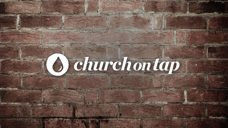
The logo type, Chronicle Display Black Italic, was chosen as a representation of the bar and grille where the church is located. Italics was incorporated as a way to differentiate its self from the bar, but still appear related. The misshaped circle/water drops reflects the messy nature and servants heart of the church.


Video Logo Design Process
This video was created as a quick way to showcase the process of the new logo design for the Church on Tap, located in Buffalo, NY. In the video I go through my reasoning on how I came to the final version of the church’s logo. The video was originally intended for the leadership of the church to view in the comfort of their homes as it would be have been difficult to gather everyone together for a full presentation.
Client Testimony
"The end product is only as good as the process use to create it. I’ve worked with many designers and am severely impressed by TJ’s thoughtfulness and thorough research in developing our visual identity. He nailed it."
Erik Eustice - a church leader at Church on Tap